Kunde: Recovery Box
Ort: Getreidemarkt 11, 1060 Wien
Jahr: 2024
Webseite: recoverybox.at
Kategorie: Branding & Innenarchitektur
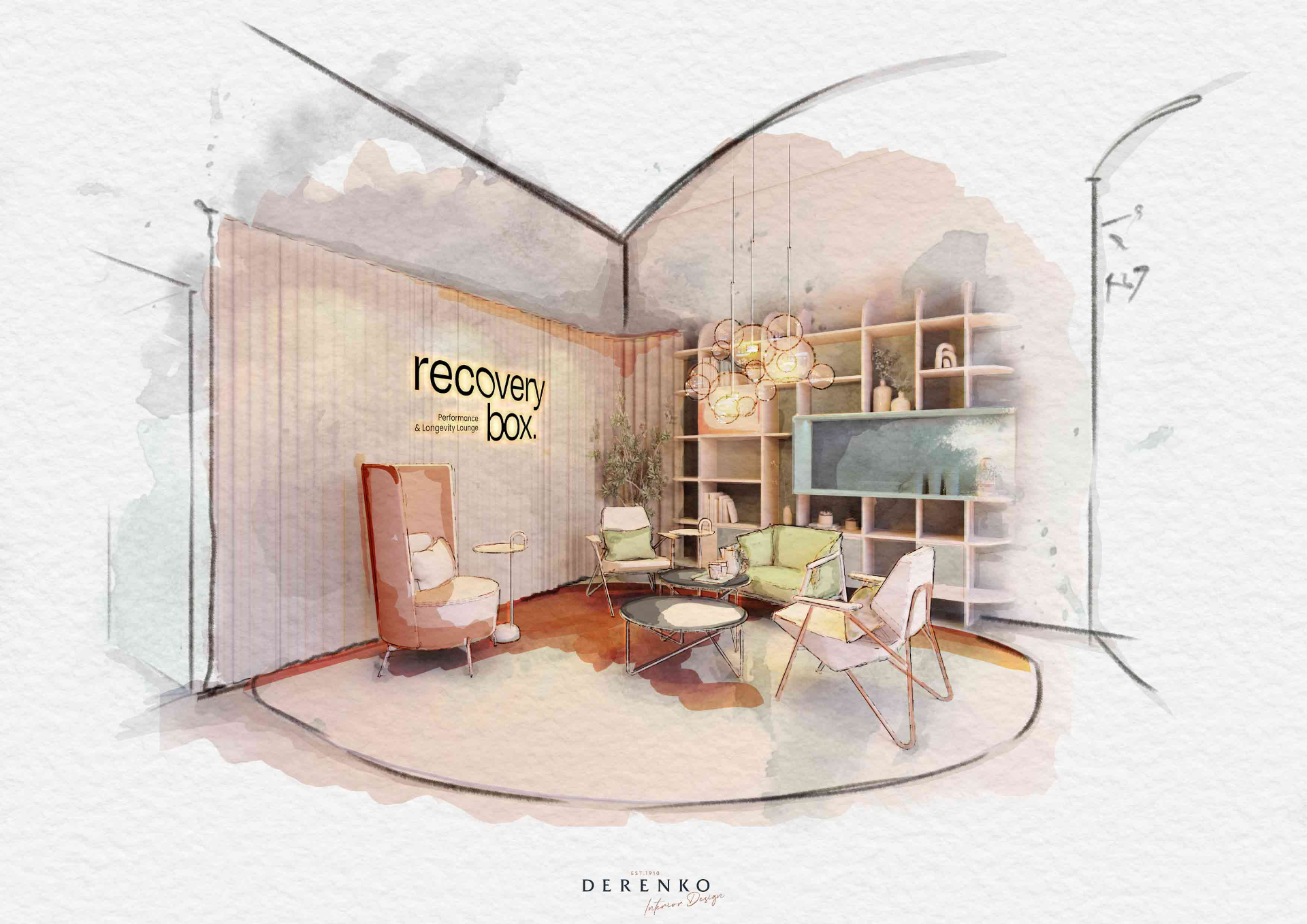
Discover state-of-the-art health technologies, personalized physiotherapy, and premium longevity supplements – all under one roof in a relaxed lounge atmosphere in the heart of Vienna.
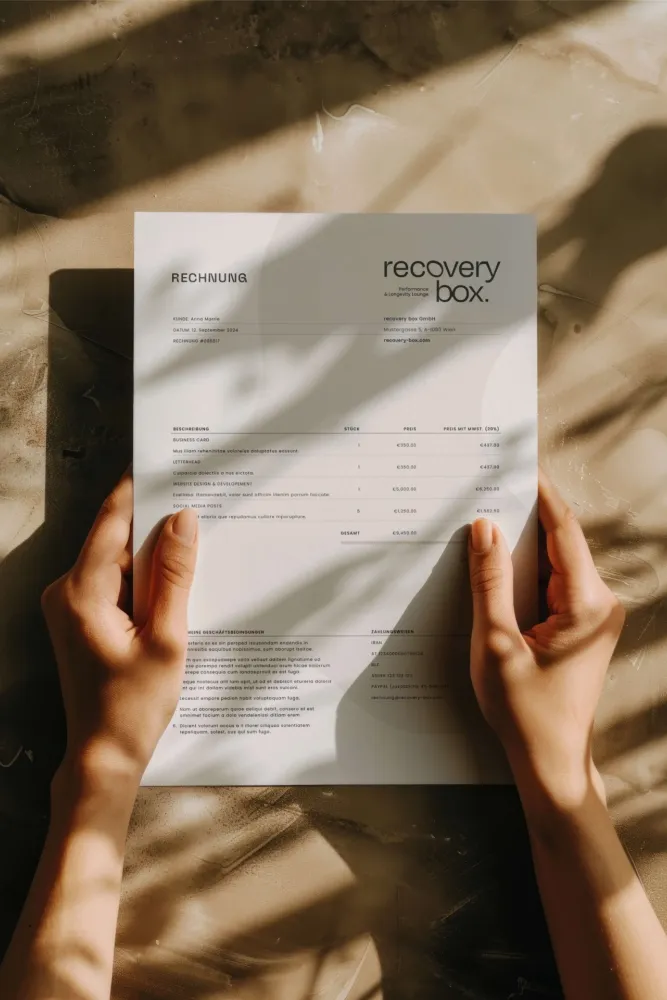
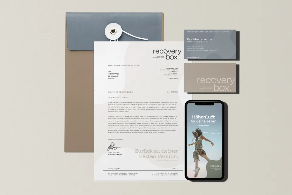
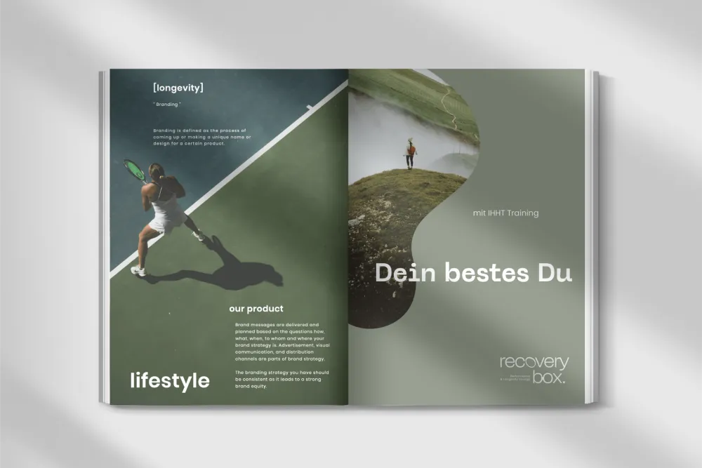
The Recovery Box is a pioneering concept for cell regeneration and sustainable performance enhancement, seamlessly combining science, technology, and nature. The branding of the Recovery Box, designed by us, merges the precision of science with the aesthetics of nature. Every aspect of the design has been meticulously crafted with attention to detail to make this synergy tangible and deliver an unparalleled user experience.
BALANCED AND CALM THROUGH A HARMONIOUS COLOR PALETTE
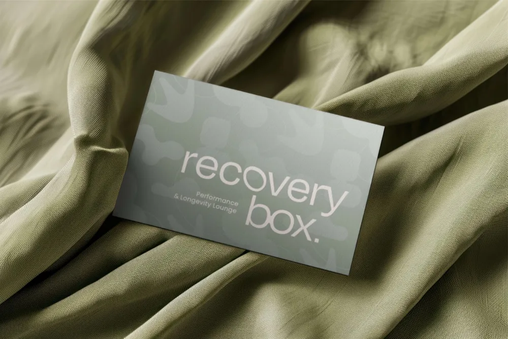
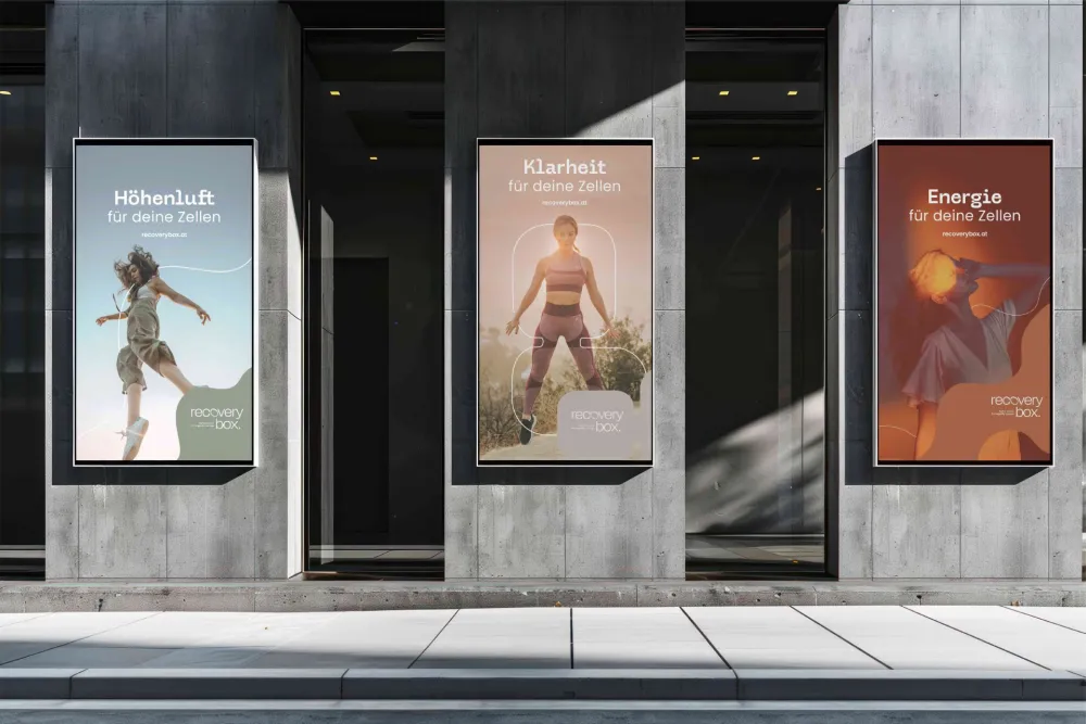
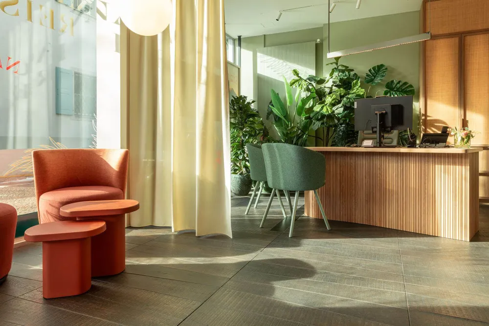
A color palette of soft earth tones – warm sand, soothing blue, and vibrant green – creates an atmosphere of harmony and regeneration. Subtle contrasts add depth to the design and emphasize the scientific precision that defines the brand.
ERGONOMIC AND FLUID: WHERE DESIGN MEETS FUNCTIONALITY
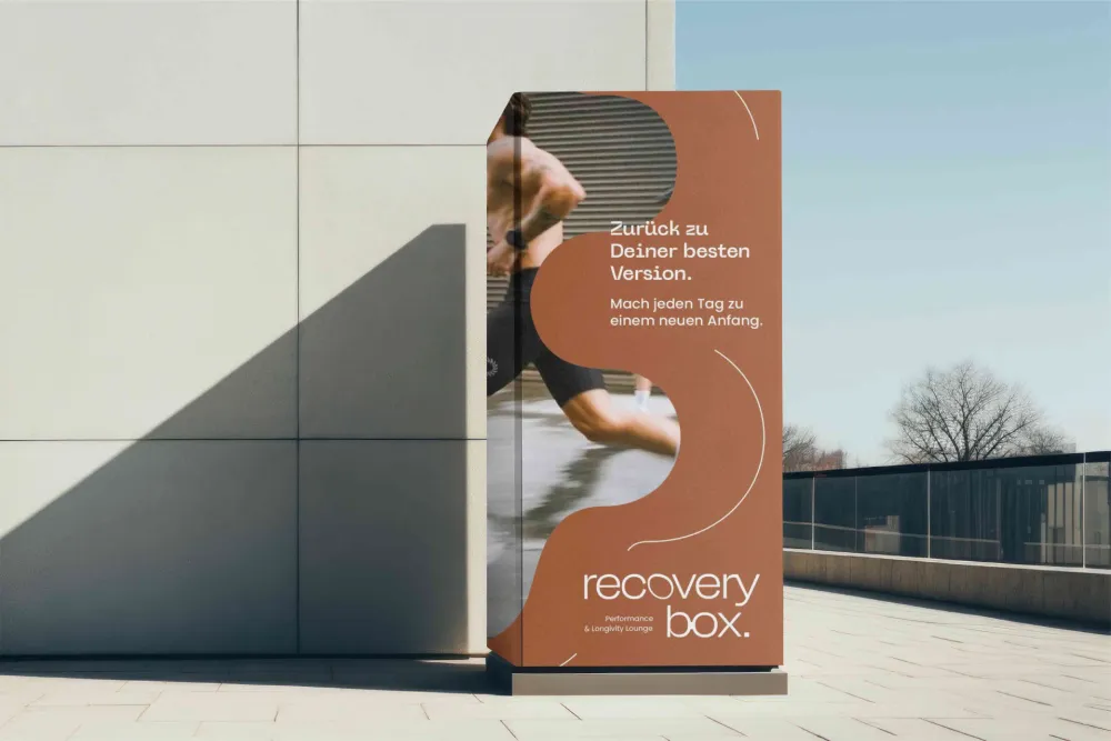
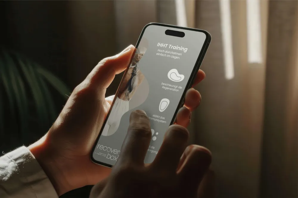
The treatments offered by the Recovery Box follow a minimalist, modern design language. Organic curves and flowing lines create an aesthetic that seamlessly blends functionality and comfort, exuding trust and a sense of well-being. Each developed form reflects not only the physical shapes of the equipment but also abstract representations of the processes and effects of the treatments.
The design concept communicates technological precision while instilling a sense of comfort and security – a key factor that sets the brand apart from its competitors.
AN INSPIRING CLAIM THAT AMPLIFIES BRAND VALUES
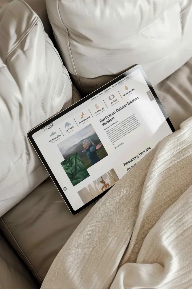
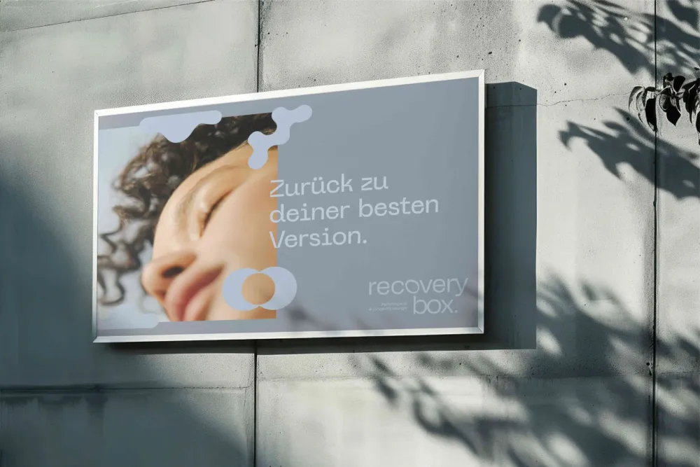
With "Back to your best version," we created a concise and impactful brand claim for the Recovery Box that combines emotional resonance with clarity.
This core message perfectly embodies the positioning of the Recovery Box – regeneration, progress, and personal optimization.
PRECISION & ORGANICITY: THE TYPOGRAPHY OF THE RECOVERY BOX
The typography balances medical and technical clarity with subtle organic elements. The logo, in particular, reinterprets cellular structures and biological forms with soft, dynamic shapes. The result is a design that makes science tangible, conveys calmness, and inspires progress.
