Customer: Wiener Wermut
Location: Heiligenstädter Straße 50-52/Top 3+4 1190 Wien
Year: 2022
Website: wienerwermut.at
Category: Brand Design
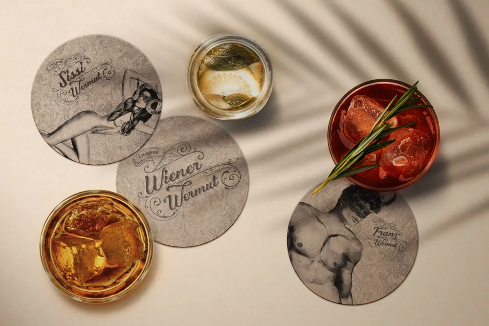
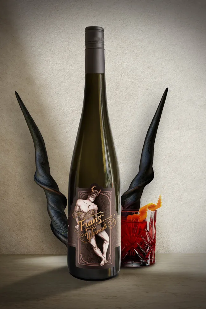
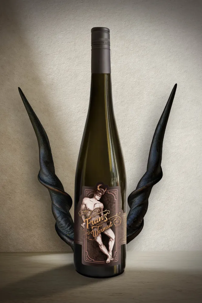
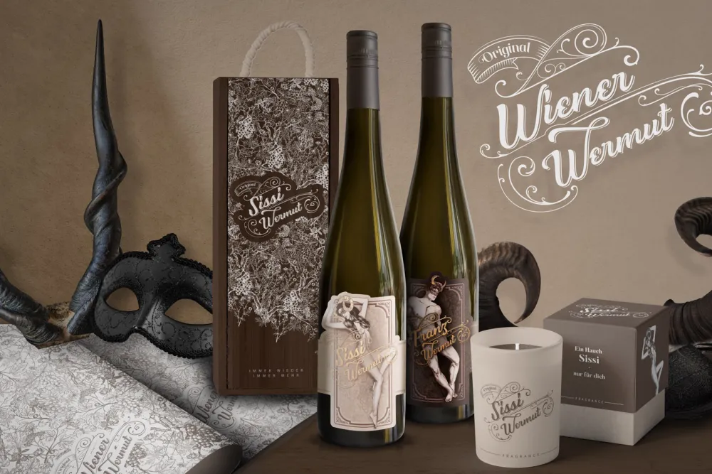
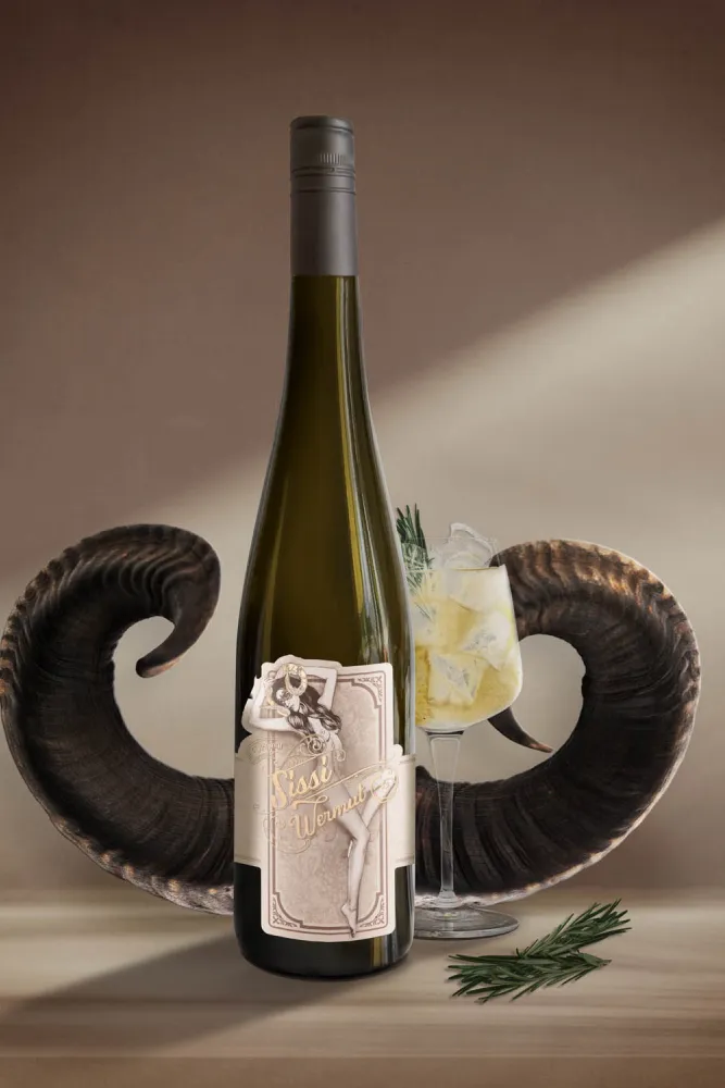
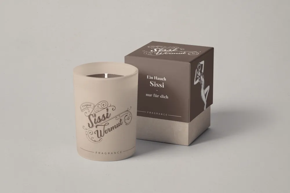
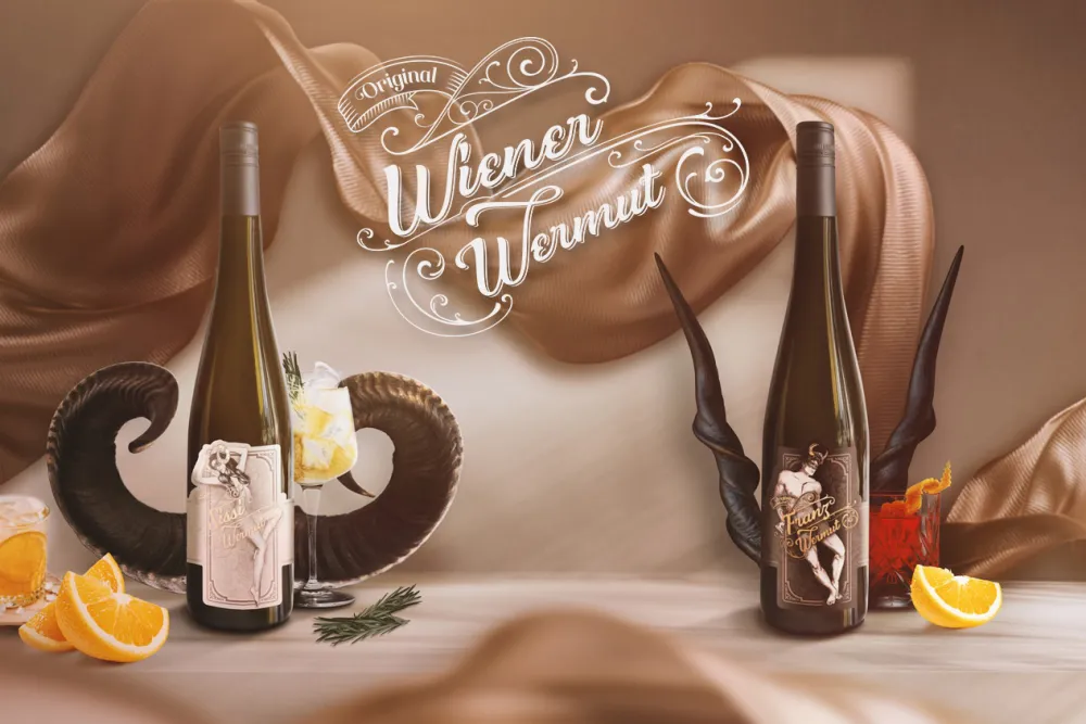
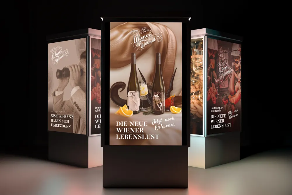
The two iconic Wiener Wermut varieties “Sissi” & “Franz” have taken on a new look while retaining the same popular aromatic experience as ever. As the full-bodied flavor develops on the palate, the new bottle design can be enjoyed and admired simultaneously. Exquisite finishes swirl around the classical style elements, allowing our two beloved Austrian monarchs to confidently triumph among the intensive aromas. The “Wiener Wermut” brand reflects this pure zest for life and symbolically succumbs to the sensation of physical freedom.
This time, when designing the labels for the bottles, we focused entirely on the sensuality and the soft finish of the aromas. The vines in the background create a harmonious pattern reminiscent of the noble fabrics of bygone days. The golden and rosé gold finishes play purposefully with pomp and glitter. Entirely in keeping with the motto: time to shine! And the cheeky, frivolous side of our main characters has also been lightly dipped in gold. From now on, the horns of “Sissi” & “Franz” glisten in the foreground while also remaining subtly in the background as a stylistic element. A full-bodied theme that matches the flavor of the popular Wiener Wermut.


